Designing a good mobile user experience and interface is not an effortless task. Today’s mobile users are sophisticated, impatient, very goal-oriented and expect to be able to immediately get what they need. (Sound familiar?)
As mobile user experience/user interface (UX/UI) design trends come and go, interface simplicity, ease of usability and valuable, relevant content will always offer the best opportunities for successful user engagement and UX.
To help ensure mobile UX success, follow these best design practices that are recommended and approved by Blue Flame Thinking.
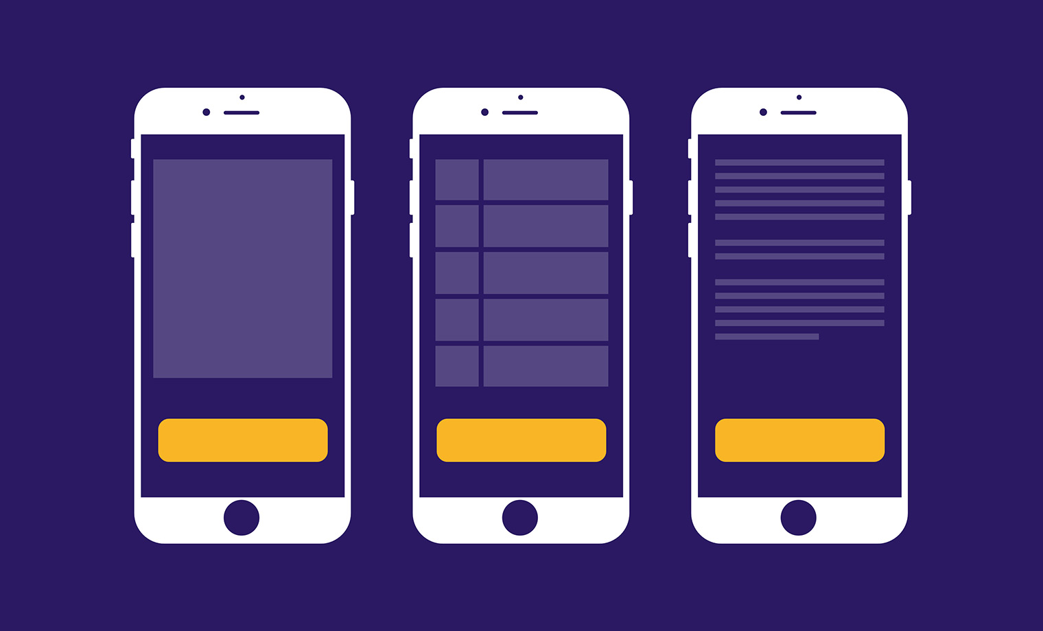
Focus on One Primary Action Per Screen
Cluttering the limited screen space of a mobile device can quickly overwhelm your user with too much information. So, even a few additional simple items with the best intentions can make the screen feel that much more complicated.
To bring focus, try to design each screen for one thing only—and ideally with no more than one call to action. Users will immediately realize what is required of them, making the experience easier to learn and use.

Make It Simple to Move Through Your Site
Even the greatest features and best content aren’t of much value if the user can’t find them. So, helping users navigate your mobile site should always be a top priority. Keep these tips in mind:
Navigation should feel familiar.
It should be intuitive and use UI patterns, iconography and design elements that are easily recognized by today’s users.
Consistency is your friend.
Don’t move or hide navigation controls on different pages. Users expect consistency—give it to them.
Give your site a clear purpose.
If your site uses good information architecture, it has been built clearly and logically in a way that requires a minimum number of actions to reach a destination. Simple is good.
Keep Important Elements Within Reach
According to Steven Hoober’s research, users prefer to view and touch the center of a mobile device’s screen. So, it’s important to keep primary calls to action front and center. Meanwhile, make secondary tasks available through menus or along the edges.

Make Text Legible
Users consume all kinds of content through their smartphones. And, displaying large amounts of information on a small screen provides a challenge.
Avoid cramming too much onto the screen and give text the space it needs to breathe. Also, design a hierarchy between different types of content using sizes and weights. Today’s modern typefaces offer a variety of options that maintain readability and usability at many sizes.

One of the most important and often overlooked rules is using sufficient color contrast for text. Insufficient contrast makes text blend in with the background, and users have to strain to read it. High contrast makes the experience easier for everyone, especially users with low vision.

Optimize and Minimize File Sizes
As the saying goes, “speed kills.” And, one of the biggest killers for your business is a slow website. Remember those impatient users from earlier? They’re, well, impatient. Large file sizes drastically affect load time, and this is even more critical for mobile websites, where connections might be less reliable. Optimized images are smaller, improving page-loading speed—not only for your users but search engines as well. Like most of us, search engines hate slow sites, and a faster site will rank higher in search engine results.
Ensure a Seamless User Experience
Your digital presence will most likely be the one users interact with first and most often within the engagement ecosystem. So, the experience should go as smoothly as possible—no matter where or how users are doing it. Today, users rarely rely on only one device for work, entertainment or accessing information. They’ll use several devices and expect to have a seamless, frictionless experience whenever they interact with your site. As an example, our work for Spartan Motors’ Utilimaster successfully offers users just such an experience from desktop to mobile to tablet.

Always Be Iterating
Mobile users’ expectations are high, and it’s up to the strategists, designers and developers to keep meeting those expectations. So, continuing to make mobile UX useful, relevant and valuable will create loyal users of your product, furthering the success of your business.