When it comes to designing a website, it’s easy to want to jump to seeing a large, beautiful site on a computer. However, focusing too heavily on that before figuring out how it will look and function on a mobile device often means a less effective result. The phrase “mobile-first design” has been around for a while and literally means the designer creates and presents the mobile experience before moving on to what it will look like on larger devices. So, let’s look at why it’s important to start with a mobile-first design.
An Optimized Mobile Experience
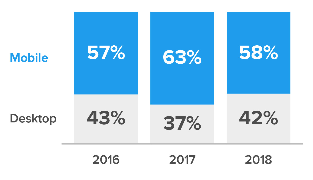
Worldwide mobile usage surpassed desktop in 2016 and continued to lead in 2018. Even if your specific audience is not currently using mobile more often than desktop, there is a good likelihood that will change.
Desktop vs. Mobile Web Visits (US)

Source: Perficient Digital
SEO is another consideration. Mobile optimization heavily impacts your SEO ranking, even if your site isn’t consumed on mobile by your audience. Your site should be able to detect device sizes, rearrange and scale content to fit smaller screens, and load smaller images for mobile in order to increase speed. Google picks up on these factors and works them into their algorithms. Even with good content and strong keywords, your website should be responsive to rank highly in Google’s search results.
How to Leverage Mobile-First Design to Your Benefit
There are three main advantages to taking this approach:
- Your focus is on figuring out what people want and when.
- It helps you provide more targeted content.
- Going from a large device to a smaller one is better in terms of scalability.
Make It Easy to Find What They’re Looking For
When users view a website on a mobile device, they only see a few hundred pixels at a time. This forces them to scroll or tap around to see everything. With this in mind, it’s critical to weigh what’s most important to both the company and the user. Giving the user only what they are most likely to need depending on where they are in the site provides a clear path and a better user experience.
For example, forms can be difficult to fill out on a phone. Designing with this in mind clarifies the information an organization really needs before a user can sign up for something like a simple newsletter. It’s also easier to see how that request can be broken down to be more digestible on mobile.
Keep Content Structured and Powerful
Using a mobile-first approach also allows you to determine which content is most important and how to best display it. Users are more likely to be on the go and need to scan things quickly. Large blocks of copy can impede their ability to do this. So, it’s important to keep copy concise without losing the meaning and tone. Information architecture also becomes even more important on mobile for this reason. Keeping things structured throughout the site allows users to navigate to what they want more quickly. Visual hierarchy is also crucial. Clearly defining headlines, subheads and body copy allows for quicker scanning.
Some organizations change or remove a site’s elements on mobile to keep the pages shorter. This isn’t a good practice, though. If it isn’t significant enough to display on a phone, the same usually holds true for desktop. Users should be able to expect a consistent experience across devices.
Additionally, Google has recognized that more and more online consumption is occurring through mobile devices and that users prefer mobile-optimized sites because they provide better experiences. So, Google now employs mobile-first indexing, which crawls the mobile version of your site and uses this for both indexing and ranking. Removing content from the mobile version of your site creates discrepancies between mobile and desktop. Google is still going to crawl your mobile site for content, but you may be hurting how your site is indexed and ranked on both mobile and desktop. This is because Google can’t accurately assess if your mobile site’s content can match a user’s query, underscoring the importance of consistent content across devices.
Scalability Is Key
The third reason for a mobile-first approach is more aesthetic and technical. It’s easier to design for mobile and figure out how to make elements scale and shift to work well for desktop than compressing large, complex designs down to mobile. Since it’s more challenging to design for mobile in general, if you get the experience right for a phone, far less will need to change when scaling the design up to desktop.
That being said, mobile-first design shouldn’t be mistaken for mobile-only design. Desktop still needs to be thoroughly thought out and designed so users have an optimal experience in that environment, too. We would just argue that it’s easier to do that when preceded by designs for smaller devices.

