Advisor Group
Brand Guidelines & Digital Standards

As one of the largest independent wealth management firms in the US, Advisor Group (AG) fosters a spirit of entrepreneurship and independence in its 7,000 advisors. AG approached Blue Flame Thinking to enhance and further refine its brand development strategy. They wanted to communicate a more genuine brand identity that would increase awareness of the company and both reflect and unify the four individual firms included under their umbrella. AG also wanted to create a set of standards that could be applied across their website through brand guidelines.
Relevancy in a Digital World
It’s essential that a website is a reflection of the brand’s true value and proposition. According to Deloitte’s 2018 Global mobile consumer survey: U.S. edition, The average user looks at their phone 52 times a day. The digital standards we developed through AG’s brand guidelines now accommodate multiple digital usages and allow for maximum flexibility and responsive elements.
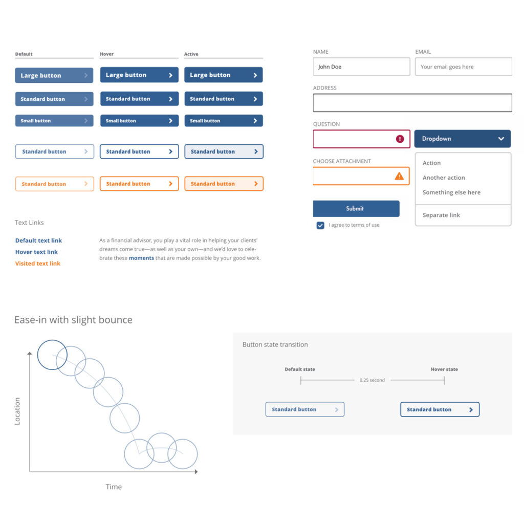
Button styling
For flexibility, a range of button sizes is provided. Exercise care when choosing to ensure the right button is used for the accompanying content. Button size and placement should reinforce action, not usurp attention.
Forms
Form elements are critical components to driving action on websites.
Motion
Any movement or animation that is not meant to be the focal point (i.e., a video or button) should be subtle so it doesn’t distract from the appearance of the site.
Infographics
When using infographics and data that give a more modern, multidimensional and dynamic look, create illustrations with a thin stroke rather than as filled-in shapes.
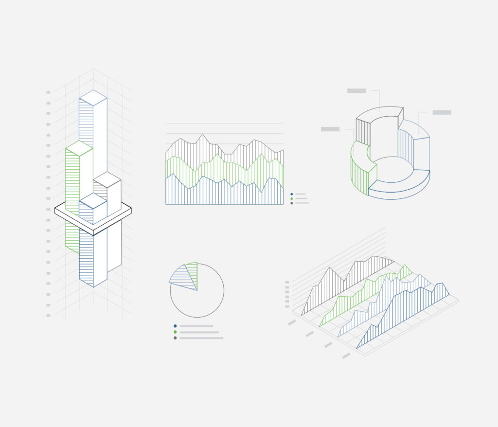
Illustrations
Intricate illustrations against the white space visually symbolize the attention to detail that AG emphasizes within its advisor network and clients.


Typography
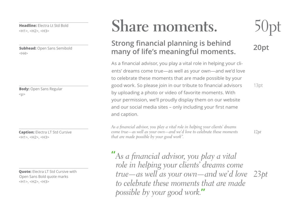
AG uses a typeface combination of Open Sans and Electra LT Std. This creates an ownable blend of serifs and sans serif. These are to be used in alternating weights to convey the firm’s modern sensibility, while highlighting the compelling nature of the content, as well as to ensure legibility and flexibility across media.
Color
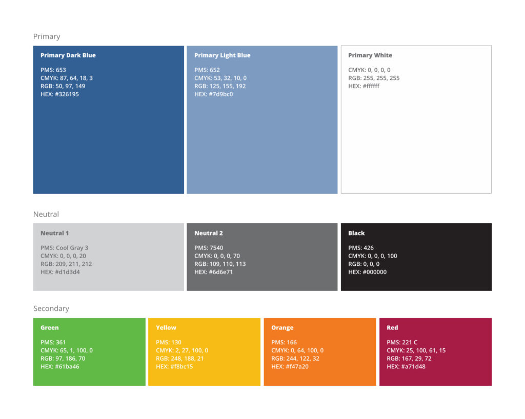
The primary colors ensure visual consistency and give the AG brand a bold presence and identity. White is included because consistent use of color—and generous use of white space in all layouts—will help reinforce the brand guidelines.
Iconography
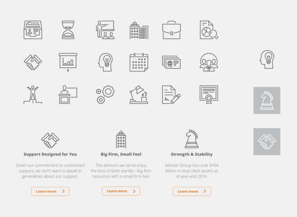
Icons are used to quickly communicate concepts in cases where imagery is not possible or where speed in understanding or space restrictions need to be given higher priority. They are professional in style, yet provide a hint of humanity while offering medium detail. No solid fills are to be used in order to keep the icons looking clean and ensuring they will be easily read even on smaller screens.
Imagery
As the visual extension of AG’s brand logo, the image library is a deliberate blend of three photographic styles:
Environmental landscapes offer inspiration and encouragement to advisors and communicate that no matter how vast or rough the terrain seems, AG provides the reliable guidance and strength that will allow advisors to persevere.
Human interaction is more than a promise; it is a commitment for AG. As a firm that leads on a person-to-person basis, AG is equally committed to empowering advisors with the ability to do the same for their clients.
Architectural support defines the corporate structure and the well-crafted solutions provided through AG. This support is as intentionally engineered as it is sustainable, ensuring advisors can place their trust in AG regardless of ongoing shifts in the investment and regulatory climates.

Strength in Numbers
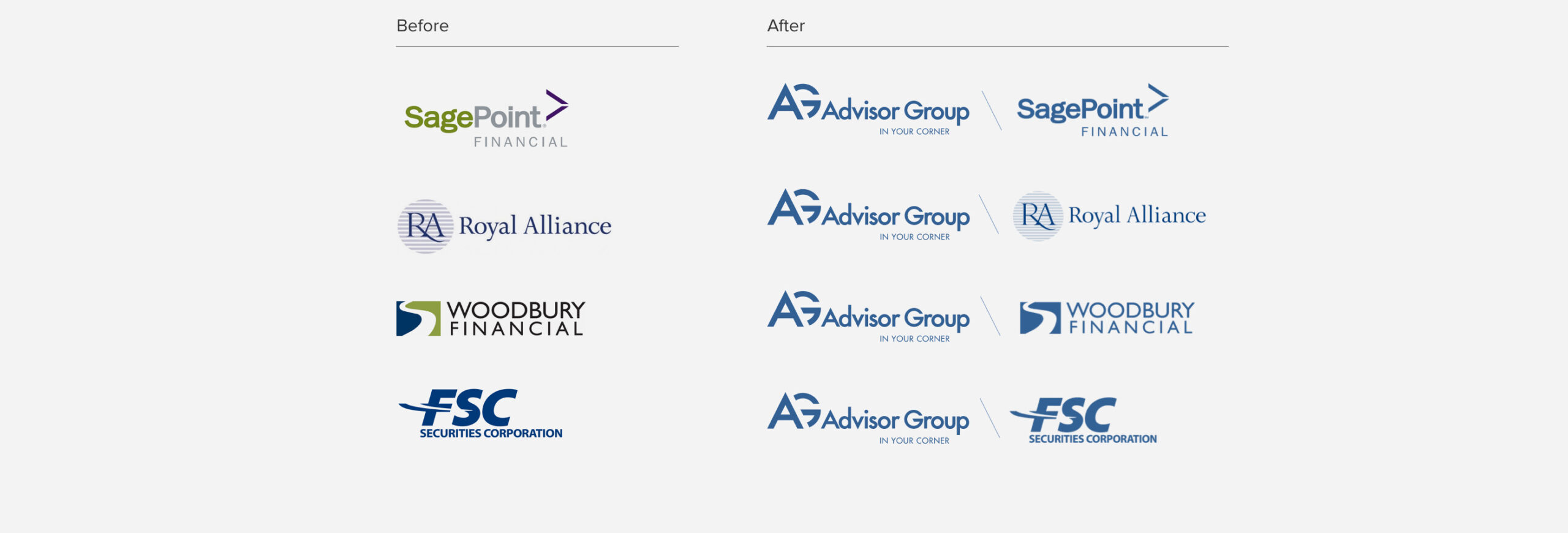
As a strong house of brands, AG brought us their challenge of developing brand guides that accurately defined their corporate brand and integrated their four distinct broker firm brands, each with their own identities and marketing needs. Through our discovery process, we worked together to uncover their unique attributes and create a solution that complements the corporate brand identity.
Are you ready to improve your digital presence?
Share this Case Study

