Fairmount Santrol
Improved User Experience

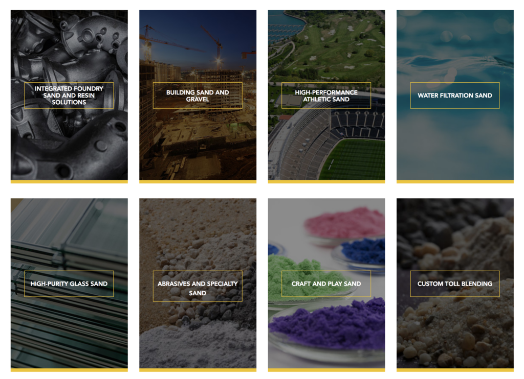
Sometimes, the amount of time spent on a corporate website can be an indicator that customers are having a hard time finding what they need. In Fairmont Santrol’s case, which has a highly complex product offering, this is exactly what was happening. The company offers a wide range of products across the mining and drilling industries. Each has its own distinct set of attributes and uses. We narrowed the focus to shorten the sales cycle–and site visitors’ frustration—by giving customers a clearer path to purchase.
Creating Product Family Comparisons
Borrowing from consumer industries like the telecommunications and cable space, we recommended that product families be grouped together to make them easier to filter and to allow for side-by-side comparison.
Better User Experience
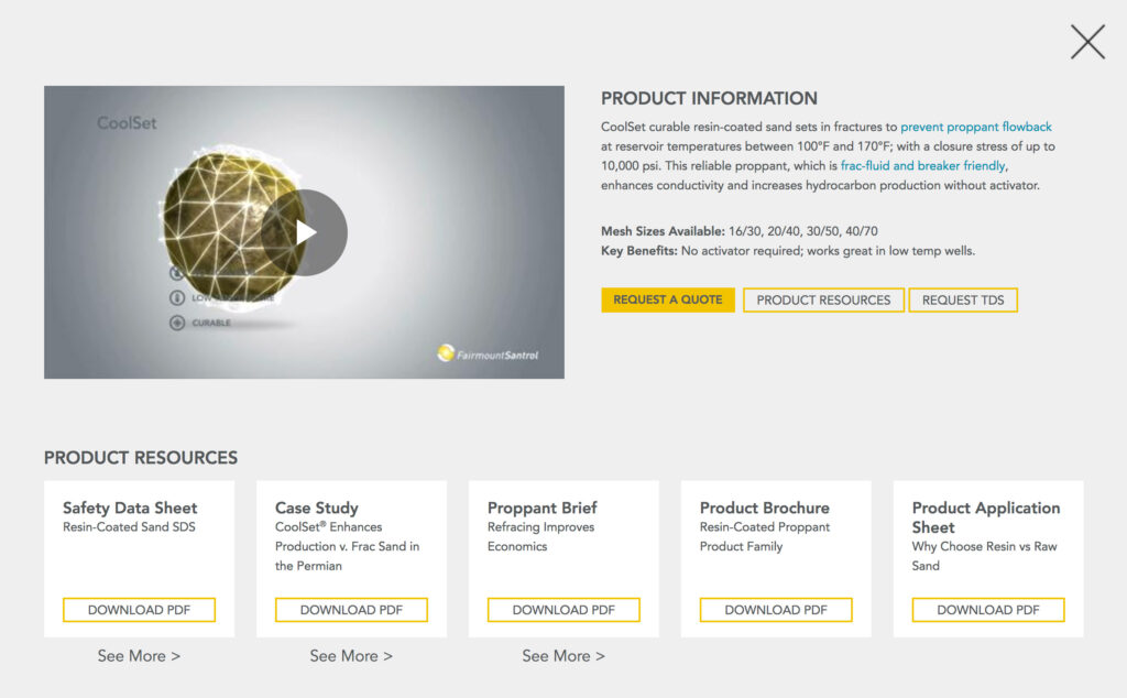
All resources now dynamically populate for each product. Next step buttons and CTAs are always visible and easy to find, and the pages fully integrate into the company’s Salesforce workflow.


An Agile Approach
After testing the new approach on one product line, and seeing how much more effective it was, the new format was applied to all product lines across the company.
Results
2.3K
Qualified Leads Generated
50%
Reduction in Page Views Per Lead
32K
PDF Downloads
Are you ready to improve your digital presence?
Share this Case Study


