In our ever-changing and technology-dominated world, your brand and digital properties need to keep up with the pace of web development trends. Just like you’ve probably upgraded from your first phone or computer to one with the latest features and functionality, implementing digital advancements on your website can enhance its performance and results. Gone are the days when table-designed sites were all that we had. The future is bright and so are the upcoming changes that are being implemented across the web.
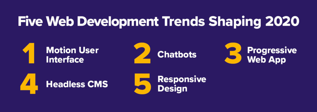
The Top Web Development Trends So Far in 2020
- Motion User Interface
- Chatbots
- Progressive Web Apps
- Headless CMS
- Responsive Design
1. Motion User Interface
Incorporating motion and animations into your user interface is a great way to stand out from static sites and engage with potential customers. When leveraged well, these elements can enhance the user experience and display your brand and company personality.
For instance, motion is very helpful in giving feedback to users by letting them know a form was submitted or they are being taken to a new page. And, adding a loading animation while a video loads or a file downloads lets them know they only have a short time to wait.
Since marketing is about telling your brand story and leaving a memorable impression, simple animations can go a long way toward engaging users and enhancing your site. Here are some great examples of animation on mobile apps:
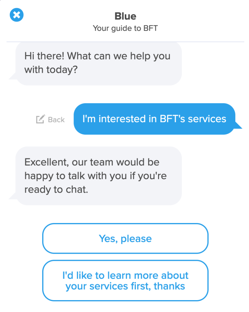
2. Chatbots
Having a way for customers to reach you and receive a timely response builds loyalty and lasting relationships. Chatbots are increasing in popularity because of the personalized experience you can have with your users. Plus, you can customize them by choosing when they appear and how they communicate. With users growing increasingly tech savvy, finding ways to effectively interact with them is very important.
Additionally, gaining business intelligence through your chatbot can help you see who is visiting your site and what information they are looking for. You can then better serve your users by understanding their needs and reasons for being on your site. Gathering this data will also help with lead generation and enable you to continue supporting your current users. If you have a lot of traffic to your site, chatbots can always be available to assist customers, rather than having a person be solely responsible for handling that much capacity.
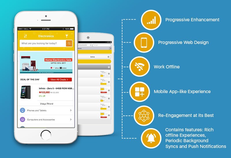
3. Progressive Web Apps
Progressive web apps (PWAs) combine the best attributes of web and mobile applications to bring an app-like experience through the web. This includes allowing you to work offline so you don’t always have to be connected.
PWAs offer other benefits, like responsiveness, which is vital to having a progressive site. They are discoverable because they are identified as “applications,” so search engines can easily find them. A PWA also loads very quickly because service workers remove the dependency on the network and instead load using data from the cache. And because PWAs don’t need to be downloaded and can simply be found with a URL, they’re linkable.
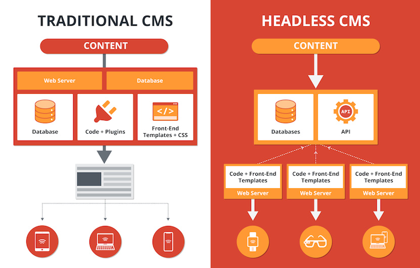
4. Headless CMS
According to Knut Melvær of Sanity.io, “A headless CMS works by giving editors an interface for managing content while providing APIs for developers to build applications on top of.” This means it’s a CMS that is focused on APIs and reusable code more than a traditional CMS. In agencies where similar types of sites are created, reusable content is necessary to increase productivity and efficiency.
Content infrastructure allows for an end to copying and pasting similar code and giving way to one central “content hub.” In turn, editing becomes easier, along with compliance changes and a well-defined and consistent brand. Keeping everything in a central space also facilitates effective collaboration and agile development.
5. Responsive Design
Responsive design is a tried and true web development trend that has come a long way. There was a time when it wasn’t a priority or even remotely a trend. Today, it has become a staple for good design and necessary for a site to be found on Google. Not only is it important for rankings, but a mobile-first design will increase your usability and overall user experience. Starting with this mindset also dramatically helps to reduce the time spent on making your site mobile. Responsive design allows you to offer a better and consistent user experience across devices. This leads people to perceive your brand and company more highly, which can help increase the user retention rate.
Another argument in favor of responsive design is that Google ranks websites better when they are mobile-friendly and utilize mobile user experience best practices. In 2018, Google announced they were focusing on these sites to crawl, index, and rank. Because more and more people are browsing on their mobile devices instead of their desktop or laptop computers, responsive design is crucial to keep people coming back to your site and to appear on Google. It is vital to your business to keep up to date with these changes so your site will continue to thrive and be seen.
Finding the Right Web Development Trend for Your Goals
All of these web development trends are becoming more and more commonplace. But, if you decide to implement motion user interface, chatbots, PWAs, headless CMS, or responsive design, your goals should align with many of the benefits of these technologies. They will significantly increase the value of your website and marketing strategy by offering better user experiences and customer retention. They will also increase personalized customer service and a unique and engaging site that’s easy to update and maintain. Not all of these technologies can be implemented quickly, but a step in the direction of growth and progressive change will ultimately help you meet your goals. Each of these trends will help to create a brand and user experience on your website that will stand out!