Madison Investments
New Funds Website
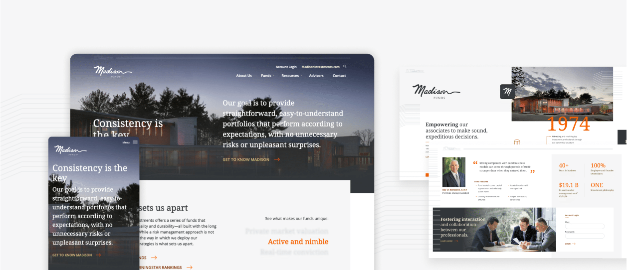
Madison wanted an improved website that effectively communicated their identity, values, and unique qualities through compelling storytelling. The user interface needed enhancements, including a modern design and intuitive navigation for easy access to information. Additionally, the website didn’t adhere to SEO best practices, presented usability challenges, and lacked full automation of fund data updates.
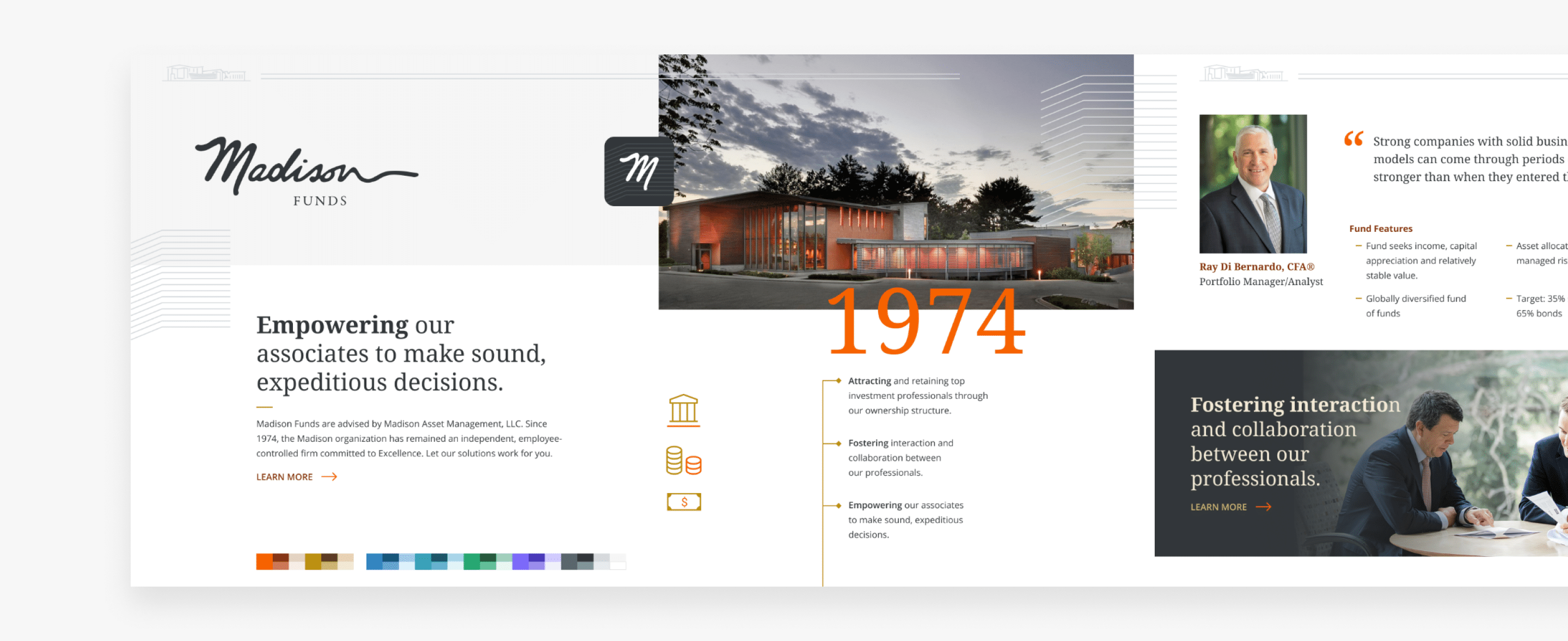
Stylescape Aligned with Corporate Brand
It was important for Madison Funds’ new site to align with the master Investments brand. We started by creating a Stylescape board that outlined all the key elements we would use and showed how they would tie in with the master brand. The board included headline and subhead fonts and styles, icon and infographic treatments, quote styles, chart and graph approaches.
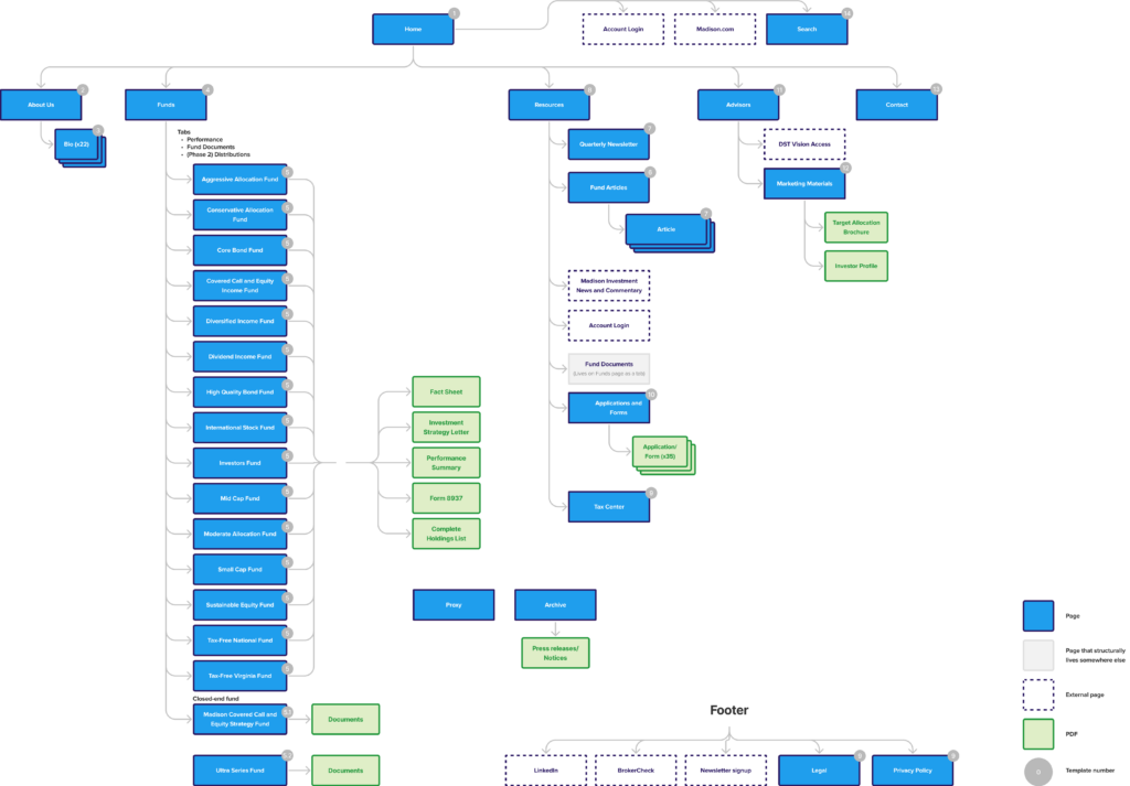
Detailed Sitemap Sets Foundation for Development
As with many sites that live within parent websites, Madison Funds had its own set of pages, but also linked through to the Investments site for important pieces, such as manager bios and to third-party sites for other information. The site map guaranteed all vital links were included, ensuring a smooth and seamless user experience.
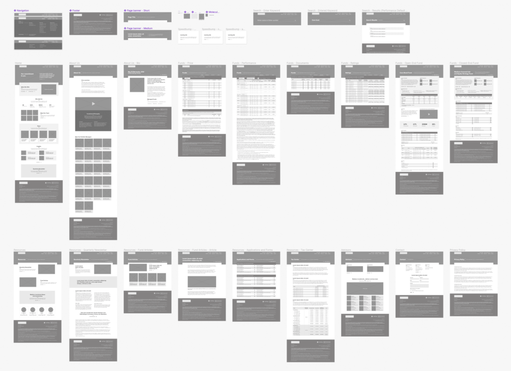
Robust Wireframes Offer Clarity
Once the Stylescape board and sitemap were approved, we developed wireframes for select pages. By outlining the structure of each page, the wireframes offered a sneak peek into the layout and content hierarchy of each section.
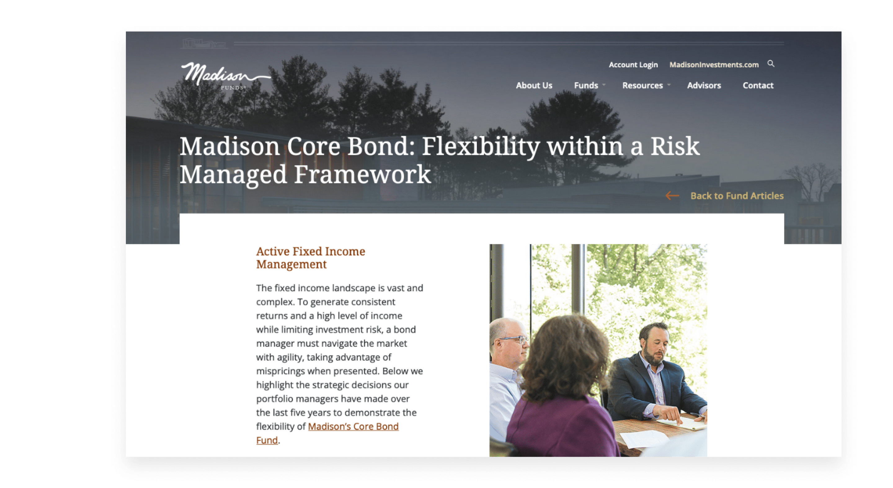
Content Created with SEO to Aid Sales Efforts
An initial crawl of their previous site uncovered 3x more URLs than needed, which included many duplicates and dead ends. We assisted with creating the content using SEO best practices to help drive organic traffic and complement marketing/sales efforts for lead generation and conversion.
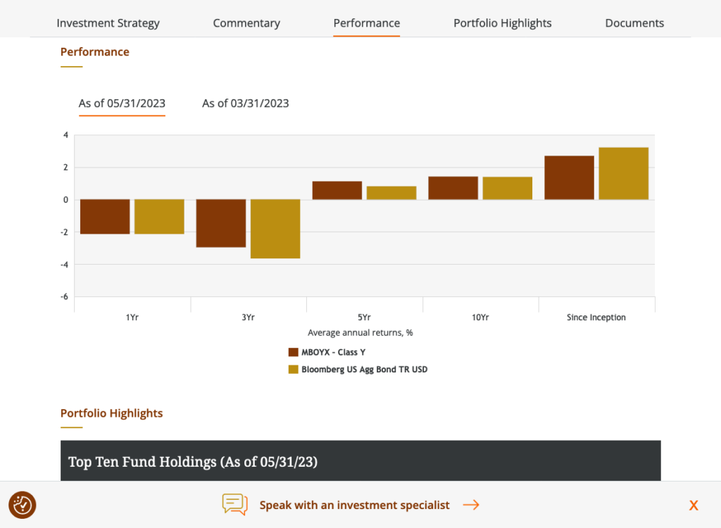
Modern Techniques in Design and Development Enhance Experience
Applying modern design and layout techniques, we were able to enhance the Funds’ image while staying within the brand boundaries of the parent Investments website. Simplicity was the goal on the development front. The site was set up for data automation and ease of use in making future updates to content and imagery.
Data Feed Consultation for Informed Integrations
Serving as a consultant, our dev team supported the Madison and third-party teams focused on data feed integration. We created a sample JSON file as a starting point, set up the SFTP with the hosting provider, and helped connect the source files with the JSON file.
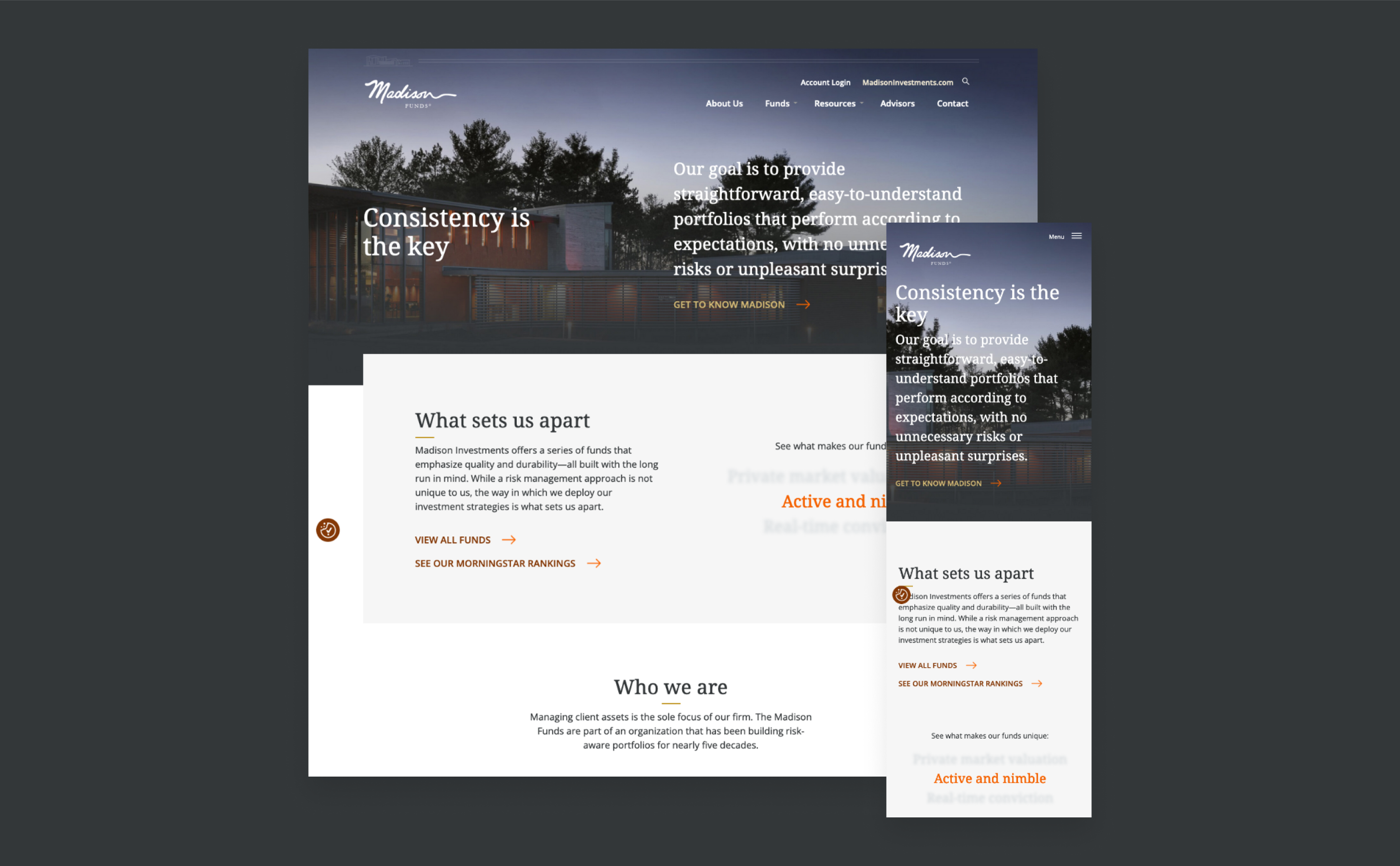
Built for Better Internal and External Experiences
Working closely with the Madison team, we created a new site that provided a more useful and direct experience for their audiences and better represented the image they wanted to portray. More modern treatments of key elements were introduced, navigation paths were streamlined, and key features such as data automation and easy updating were implemented.
Results
+66%
Avg. Time on Page
+166.5%
Increase in Engagement
Need help getting started?
Share this Case Study


